Foundation has its roots in the ZURB style guide, a collection of HTML, CSS and Javascript that helped us quickly design amazing websites. It’s now used by millions of designers and developers and powering some of the biggest and most popular sites on the web. Here’s the story of how Foundation became the most advanced responsive front-end framework in the world.
Foundation is a responsive front-end framework.
Easy-to-use HTML, CSS and Javascript to help create all kinds of awesome.
A front-end Framework is a collection of HTML, CSS, and JavaScript containing design patterns that you can build upon. They keep you from wasting time rewriting boring, boilerplate code over and over again. In addition to saving time, they actually help you write better code. Sites built on Foundation work great on multiple devices including desktop and laptop computers, tablets, and mobile phones because it is a responsive framework that uses CSS media queries and a mobile-first approach. Designers can create unique designs for a variety of screen sizes, ensuring a smooth experience no matter the device.

Foundation by the numbers
Top 30
Open Source Project
27K
Daily Google Searches
850+
Contributors
23,900
GitHub Stars
5200
Forks on GitHub
12,100
Commits So Far
Foundation includes tools and resources like a robust and flexible responsive grid with tons of handy options, modals, typography, navigation components, and form elements that designers can quickly plug in to their products. Foundation is also modular, meaning you can use as little or as much of it as you need.
Because developers all around the world (including us here at ZURB) are using Foundation daily, lots of iteration is made on the code and bugs are constantly being squashed. Think of it as a collection of shared wisdom, with an entire global community figuring out best practices. Easy-to-use, quick to learn and full of powerful tools, Foundation is the most advanced front-end framework available.

Built for Four Corners
When we released Foundation in 2011, we wanted to create a way for people to easily build responsive sites, and that continues to be our driving motivation. At ZURB, we almost exclusively create responsive sites for ourselves, and our clients, and Foundation plays a huge role in that. We use it every day, and we know it works.
Built on Sass
We decided that Foundation would be built on Sass (Scss, technically) a little over a year ago and we’ve never looked back. Not only is Sass in constant development, but through Sass you get the power of semantic code, faster styling, and tons of awesome programmatic features.
Foundation 6’s Prime Directive
Our goal: to provide a framework that allows others (and ourselves) to build better designed, future-friendly sites. Being the fastest way to responsively prototype and build for any device is not enough. Foundation also has to make us better designers that thrive in the ever-evolving world of mobile devices. That’s why we strive to make every new version of Foundation more advanced so you can code smarter and faster. Explore Foundation's Features →

Faster for Users
Foundation has a faster core that allows you to create beautifully optimized pages for whatever screen you want. The updated core also removes unnecessary wait time for users, especially for animations and transitions. The new updated visual style is simpler, cleaner, sexier and faster to restyle.

Faster to Code
With a medium grid and custom semantic breakpoints, creating websites and applications for any device is faster than ever. There's a new command line tool that allows you to spin up Foundation projects at super speeds. And our Foundation Business service allows you to receive professional support, consulting, tools and training for all your company projects.

Faster to Learn
To help you improve your future-friendly website building skills, we've improved our documentation and created a community forum so you can learn more quickly. We've also written a new "Getting Started" guide that gets you up going with Foundation faster than you can make the Kessel Run. There's also our Foundation Forum where you can ask the entire Foundation community for help.
The Foundation for Your Business
How Foundation is the professional choice for companies
Foundation isn't solely for individual designers, but for entire teams. And its benefits are proven every day here at ZURB. We battle test the framework daily on every client or internal project that we do, from marketing sites to web/mobile applications. And if it helps us do what we do, then it can certainly help other companies, designers and developers as well. That makes Foundation the perfect foundation for any business's product. And we can help. Learn more about Foundation Business →

Foundation Support
We know how important it is for you to get solutions. We have a team ready to answer your questions.

Engineering Studios
We've been building products since 1998 and we can help you use Foundation for your next project.

Foundation Training
We have a growing number of online courses to get your team started with Foundation. We can also come to you for custom training.

Upload your Code
Notable offers a suite of apps to help you design products, and allows you to host and share your Foundation code too.
History of Foundation
A little backstory on how and why Foundation was created and grown.
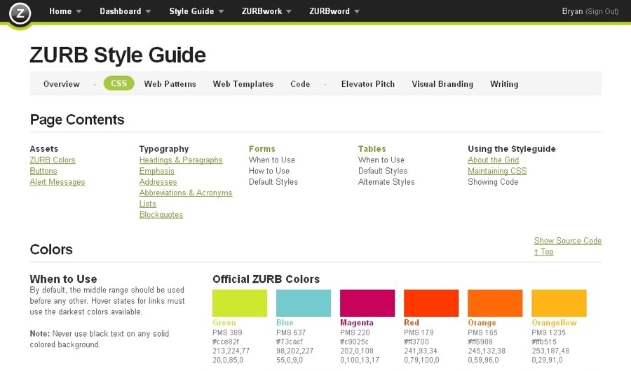
Foundation had its secret origins in the ZURB style guide back in 2008, which we used on every client project. Eventually, we decided we needed a framework that allowed us to prototype rapidly. We took our global CSS, jQuery plugins, common elements and best practices, and whipped them into what became Foundation, which we first released to the public in 2011. We decided to open-source Foundation because we knew it would help push responsive design forward, but mostly to help people design better and faster.
Like Hari Seldon, we predicted the future. We saw that mobile was becoming more popular — and more important. We knew we had to have something more functional and fluid to work on different screens, different orientations. That the framework had to be responsive was a no-brainer. And we were the first open-source framework to be responsive. We were also the first semantic framework and the first to be Mobile First. When Foundation 5 came out, we were also be the first to include Sass partials.
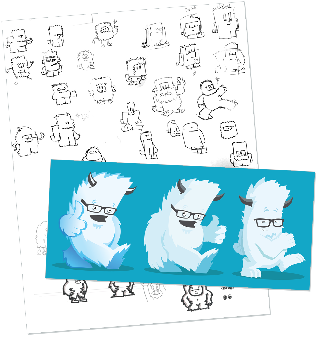
Throught the years, Foundation has grown a dedicated community of designers and developers. Along with that, our mascot, the Yeti has also changed. We continue to explore uncharted territories to ensure Foundation remains the most advanced responsive front-end framework in the world … and beyond!
A brief timeline
A quick look at how Foundation has grown through the years.
2008
- The ZURB Style Guide is created to help us speed up our work. It’s a handy collection of HTML, CSS and Javascript that we use on every client project. The ideas of ZURB Style Guide evolve over the years and form the basis for a new framework, Foundation.
2010
- ZURB style guide was solidified and named Foundation. It is being used internally on all client projects and ZURB sites and apps.
2011
- Foundation 2.0 is released to the public as an open source project! Foundation is the first responsive front-end framework and helps lead the charge for RWD across the web.
2012
- Foundation 3.0 is released! This version comes with Sass and is the first framework to use mixins.
2013
-
February
This year saw not one, but three releases to Foundation! Version 4 went mobile first, added many new components, and came with a visual update. Our responsive image plugin called Interchange was added to Foundation to make sites built with it load even faster. -
November
Foundation 5 is all about speed. It made learning, using and developing with the framework faster than ever! More new components like Equalizer, Off-canvas, and Icon-bar make a more complete package. Our responsive content plugin, Interchange can now swap in HTML content and images based on screen size. -
November
Ink (Soon to be Foundation for Emails), our responsive email framework is launched at the end of the year and helps designers easily create beautiful, responsive emails.
2014
- We launched Foundation for Apps, the first front-end framework created for developing fully responsive web apps. Foundation for Apps is now part of the ZURB Playground.
2015
- Both Foundation for Sites and Emails frameworks are united under the Foundation name, a complete solution for quickly building responsive websites, apps and emails.
About ZURB
A T-shaped team of product designers changing the way people around the world design website, products and services.

ZURB is a product design company based in the Campbell, CA. Since 1998, we've partnered with companies like Samsung, eBay, McAfee, Mozilla, Netflix, SAP and over 250 startups to design better products, websites and services. We've considered our customers and employees integral parts of our success as a company. No matter their job title or role, we consider all of them designers. They've helped us build an amazing company and consistently focused us on designing great products and services.
Our Foundation open-source front-end frameworks are used by millions of designers and developers around the world to create amazing responsive websites, applications and emails. Our Notable Platform is built for Progressive Design, because getting from vision to product is hard work. It takes momentum and drive to learn from each iteration and get buy-in along the way. Most of all, it takes a team working together, pushing each other toward the win.
Learn more about ZURB →Brands using Foundation:
What We've Written About Foundation
We've been writing about Foundation and responsive design for awhile now. The Foundation blog is the place to keep up with the next version, releases, and other responsive design goodies.
Read Our Previous Articles →